
Статья:
Hermès Box 인증 가이드(비교: 다른 회사 대
Hermès Box 인증 가이드(비교: 다른 회사 대 Thierry Studio )
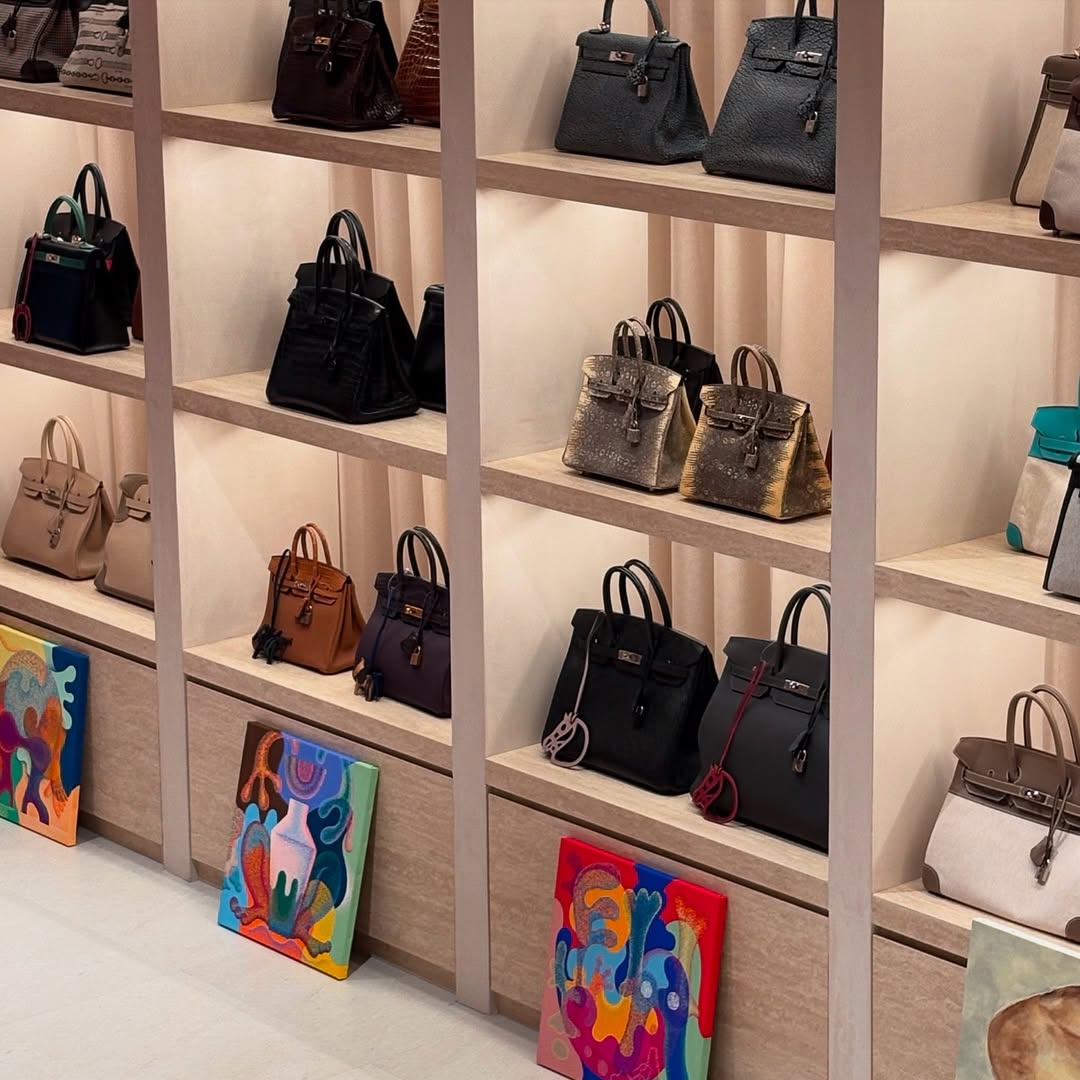
에르메스 오렌지 박스: 상징적인 색상의 비하인드 스토리

우리가 연상하는 시그니처 오렌지 컬러
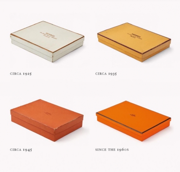
오늘날 에르메스는 항상 그 브랜드의 선택은 아니었습니다.
1920년대에 에르메스는 원래
금색 테두리가 있는 크림색 상자.
1930년대에 상자가 노란색으로 바뀌었습니다.
에르메스가 오렌지색을 사용하기 시작한 것은 1940년대에 들어서서였다.
1960년대에 우리가 지금 알고 있는 오렌지색 상자
에르메스의 상징으로 자리매김하게 되었습니다.
오렌지 박스의 예상치 못한 기원
제2차 세계대전 이후, 물질적 부족으로 인해
고급 크림을 공급하는 것은 불가능합니다.
에르메스가 이전에 사용했던 노란색 상자.
다른 선택 사항이 없었기 때문에 Hermès는 오렌지색으로 만족해야 했습니다.
당시에는 수요가 별로 없었던 색상이었습니다.
이것은 에르메스의 첫 번째 선택은 아니었지만, 변화를 받아들였습니다.
시간이 지나면서 오렌지색 상자는 사치의 상징이 되었습니다.
 메르세데스-벤츠 G-Wagons
오늘, "에르메스 오렌지" 너무 유명해서 심지어
고급 고급 자동차의 내부에 사용되었습니다.
롤스로이스와 메르세데스-벤츠 G-왜건.
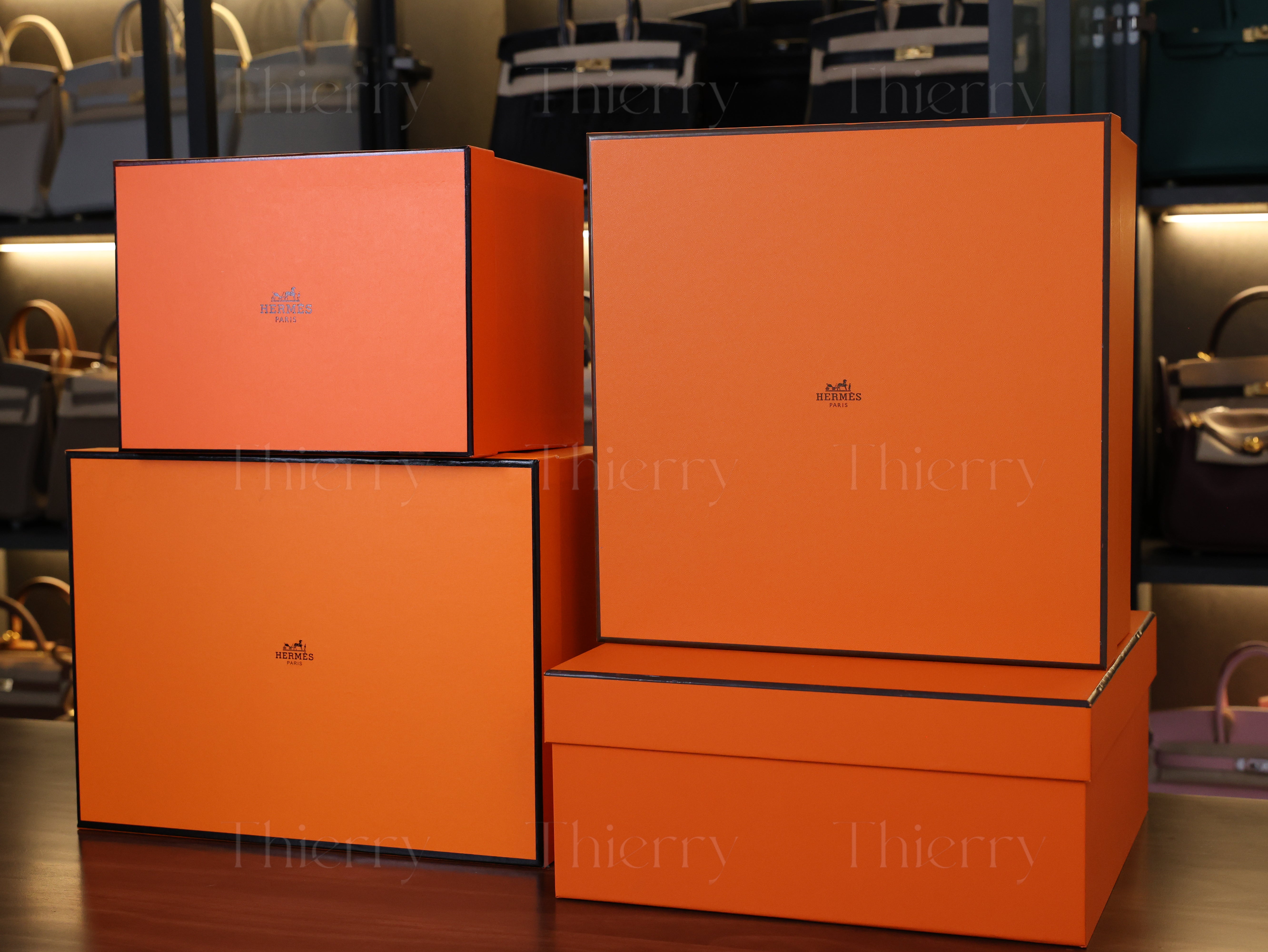
에르메스 박스 안의 숨겨진 기능
에르메스 상자에 대한 흥미로운 사실이 또 하나 있습니다.


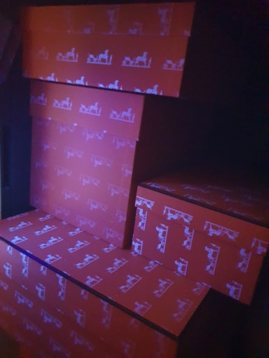
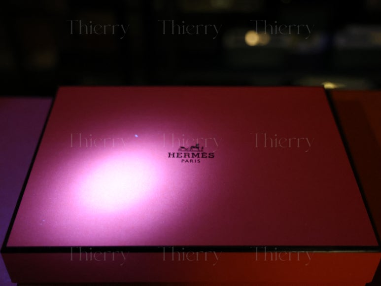
[정품 에르메스 박스]
자외선 아래에서,
정품 에르메스 상자에는 숨겨진 로고가 있습니다.
하지만 일부 위조 상자에는 이제 유사한 UV 로고도 표시되어 있습니다.
진짜와 가짜를 구별하기 어렵게 만듭니다.

이를 해결하기 위해 우리는 다음의 비교를 준비했습니다.
다양한 출처의 Hermès 상자, 포함
다양한 오렌지 상자 비교
첫눈에 보면 가장 큰 차이점은
상자들 중에는 오렌지색 음영.
사진상에서는 색상이 비슷해 보일 수 있지만
자동 색상 보정으로 인해
실제 색상은 사람마다 상당히 다릅니다.
제품: 너무 밝아서 거의 빨간색이다
B 제품: 너무 창백하다
C 제품: 진한 주황색이지만 정확하지 않음
상자의 색상이 실제 색상과 크게 다를 경우
진짜 색상이라면 자외선을 사용하지 않고도 가짜 색상을 알아낼 수 있는 경우가 많습니다.
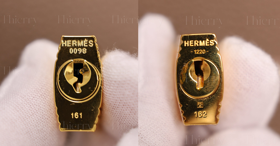
자외선 테스트: 로고가 얼마나 잘 복제되었는가?
각 상자가 자외선 아래에서 어떤 성능을 보이는지 살펴보겠습니다.
[에이]

[비]

이 상자는 자외선 아래에서는 로고가 보이지 않습니다.
높은 가격대(Birkin 25의 경우 약 1,500~1,800달러)에도 불구하고,
그들은 이러한 기본적인 진위성 검사에 실패했습니다.
[

로고가 선명하고 깨끗하게 나타납니다.
마치 진짜 에르메스 상자와 같습니다.
[기음]


C 제품(2,400달러 이상에 판매됨)
로고는 나타나지만 품질이 좋지 않습니다.
가장자리가 흐릿하고, 세부 사항이 선명하지 않습니다.
이제 비교해 봅시다
[왼쪽 - 티에리 / 오른쪽 - C]

옆에 놓았을 때
C 제품이 다소 거칠고 부정확해 보입니다.
자세한 비교를 위해 자세히 살펴보겠습니다.
[기음]

C 제품: 로고가 희미하고 세부 정보가 부족합니다.
여기서 문제는 카메라 초점이 아닙니다.
흐릿하게 보일 수도 있지만, 실제로 로고는 이렇게 나타납니다.
UV 조명이 로고를 드러내는 동안,
세부적인 내용이 전혀 부족합니다.
만약 당신이 지불하고 있다면 2000달러 제품에 대한
그리고 이런 상자를 받게 됩니다...
로고가 전혀 없는 상자를 받는 것과 같지 않을까요?
차이점은 바로 눈에 띄겠죠.
[

반면에,
말을 정확하게 자세히 묘사하고
탁월한 선명도로 운반합니다.
UV 광선에 노출되면 이 수준의 정제가 이루어집니다.
보장하기 위해 필요한 진짜같은 모습.
물론, 모든 사람이 UV 조명 아래에서 상자를 체크하지는 않을 것입니다.
하지만 만약 당신이 하나를 받을 것이라면,
완벽하게 만들어진 버전을 선호하지 않으세요?
이제 마지막으로 나란히 비교해 보겠습니다.

~에
우리 제품뿐만 아니라 포장 자체.
귀하의 신뢰와 모든 세부 사항에 대한 세심한 관심에 감사드립니다! :)